Theme: Will experiment with identifying the beautiful natural forms in my world. These forms will be shown in pattern and possibly be developed into adornment items/functional items.
Body of Work #1
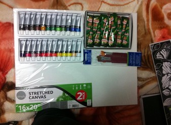
The materials I used for my first body of work was henna, acrylic paint, paint brushes and a canvas as you can see in the image above. These materials were in good quality and I was able to successfully accomplish my painting apart from the fact that I had to change up my idea. One thing about the paint that was quite upsetting about the acrylic paint was that it was small tubes for each colour and I felt as if the paint would finish quickly. Surprisingly the paint hasn't finished yet and hopefully does not anytime soon!
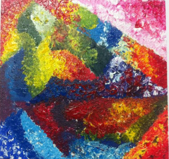
The image above shows my first attempt of the stippling effect with acrylic paint. I really enjoyed this method and also feel like its the method I work best with when it comes to acrylic paint. Unfortunately I have not tried stippling with pen or marker yet but that is definitely something I'm looking forward to. The image below shows that I didn't make the stippling effect allow the paint to stick up as it does in the first image because I thought that would ruin the effect of the thick henna.
I used many pictures from Google such as the one you see above to help me think of designs to put all over my canvas. To be honest, thinking of so many designs at a point got difficult but I managed to make sure none of them looked the same throughout the canvas.
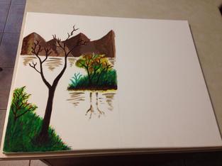
This is an image of my background being completed and my design as the top coat partially done. As you can see at the right side that the paint looks off and not as smooth as it looks on the left side as the henna starts to come in. This was where i started to realize that the henna really does bring a cool effect on the painting.
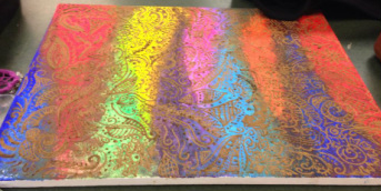
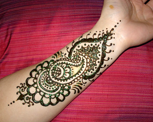
This is my first completed body of work. As you may have noticed the darkness of the henna lightened up because henna doesn't stay wet which means as it dries the colour of the henna changes. It eventually dries up so much that it cracks off and especially when it's applied on skin once the henna falls off it comes out as a nice red.
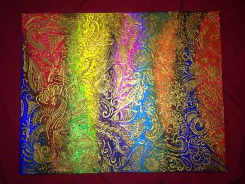
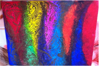
Thankfully, I managed to edit my final piece before presenting it at the art show. Ms Showalter's advice towards this piece really helped me a lot! She recommended the metalic paint over the henna because it would give it a better effect and as she did it definitely did.
Body of Work #2
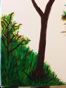
This is a close up view of the grass to display the different colors that is required to receive the look of the grass being somewhat realistic. I also chose to add a lighter color within the tree and the branches to ensure that the image didn't appear flat.
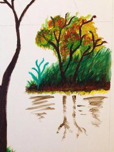
This image shows what I did to make sure people would see this as the reflection that appears onto the water. The detail of the branches are displayed in a lighter brown which seems to be fading because its a reflection; it shouldn't be as solid as the rest of the image.
At this point in time, one half of the painting has been completed which is the country side. The main idea of this painting was to have one side to represent my mom's life when she was back home which was simple, and not so stressful. The other side represents her life today which is completely different which she usually describes as busy, stressful and pretty much unhappy. She feels as if she was able to be relaxed back then and come home to big family whereas now she barely spends time with her family.
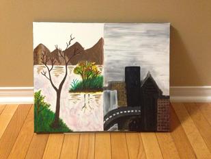
Finally, the completed painting. Most people commented saying I should have let the painting fade from one extreme to another but I felt as if that would ruin the whole concept. My point of view was that every small detail should display my mom's opinion towards life so the fact that her life suddenly went from one lifestyle to another one which is why I had the sudden change within my painting.
The piece I did above did not satisfy Ms Showalter and looking back it I can really see why it wasn't at her standards. Comparing the one I've done now definitely looks a lot better and improved and i'm glad i had her great advice!
Body of Work #3
I originally used the sharpie markers to complete my body of work but i found these markers to be a bit thicker and useful.
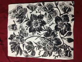
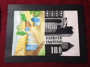
This piece was done with a sharpie marker. I looked up the prints with floral incorporated and referred to those as examples and thought of this. A lot of people said that adding some color to a piece like this would definitely look a lot better.
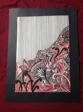
Using the advice from peers and teachers I came up with an idea like this. More like complexity vs. Simplicity. As people said adding the red did end up making the print look better.
Body of Work #4
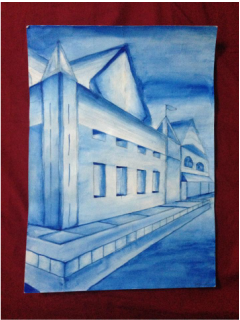
This was a previous painting done by me last semester using watercolor. I was inspired by this particular painting to work with watercolor because I believe that I work best with watercolor.
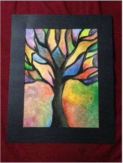
This painting came from the idea of making something dead look lively. I painted a dead tree with black watercolor and surrounded it with a colorful background.
Body of work #5
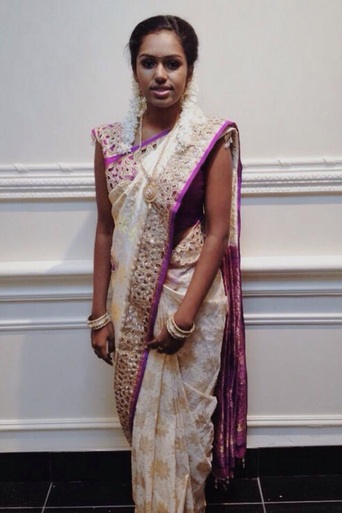
Finally, the coolest piece of all! I really enjoyed designing this saree with my dad's help. The fact that my dad has his own store was definitely beneficial for me. Designing this saree wasn't hard because the people back in India had a variety of fabric and I was told to choose the fabric color and design. I had to physically draw out how I wanted the border of this saree as well. The best part of making this saree was when i got to wear it!
